After creating Spirited Away and a custom Berserk animation in Blender, I’ve learned a few tips and techniques that I want to share with you, so that you can take advantage of them immediately and don’t have to randomly stumble across them like I did.
These will give your characters that little bit of extra polish and makes sure that you’re not wasting hours refining your line art or applying a stepped interpolation modifier to every single parameter in your graph editor. :D
Let’s start with a juicy one…
Add depth to your character’s eyes
The eyes of anime characters are big anyway, so why not make them as fancy as possible!
It took me a while to find a shader setup that was able to create the desired effect that I wanted, but then I found this tweet by Late as Usual:
https://twitter.com/lateasusual_/status/1670179625069162496
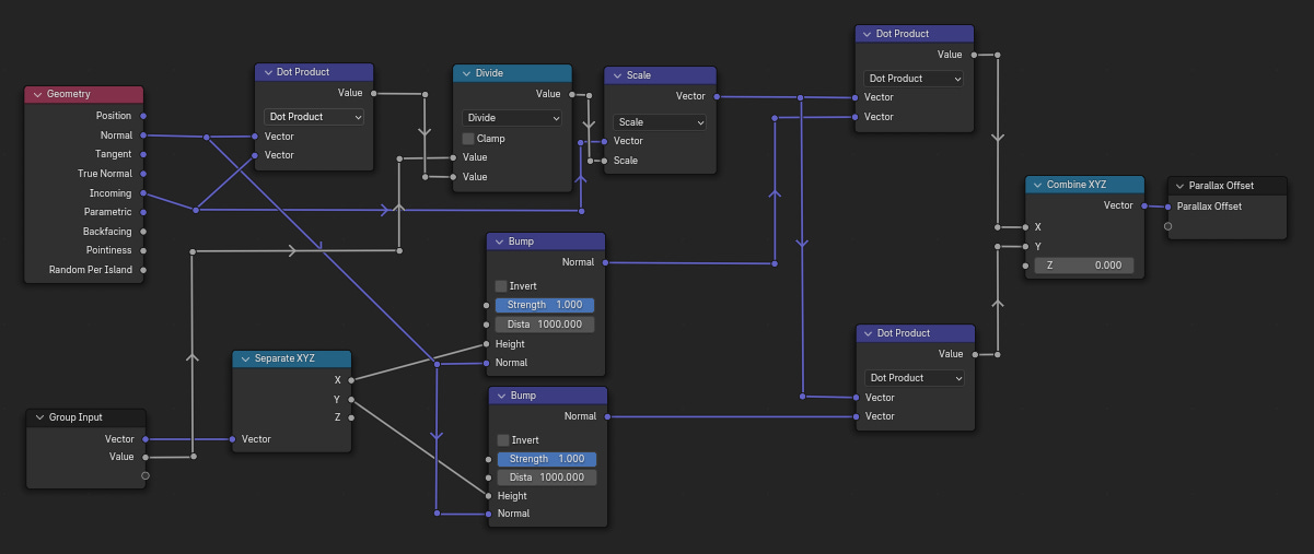
The node setup for this effect is pretty simple compared to other methods I have seen. Here I’ve tried to organize it a bit more so that it’s even easier to recreate:
This system works in layers, and every node-frame you see in the first screenshot (Base_Color, Ridges, Highlights) is one layer. Now the only thing you need to adjust to customize the depth for each layer is the “Scale” node in each frame. The higher the value is, the deeper the layer will appear.
Of course you can also use a single layer, but it will look better with multiple.
Here are the layers, I have used in the GIF at the beginning of this section.
Keep in mind, that all layers except for the lowest one need to have transparency so that you can see the layer(s) behind them.
One more trick you can try is to make your iris disk bulge outwards a little. It changes the way the parallax effect looks, but it also allows the disk to still be visible from a steeper angle (see below).
Animation Timesaver
This one’s a small tip but it can have a huge impact.
To save a lot of time, traditional anime are only animated every second frame. Sometimes even less if the character doesn’t move much or to achieve a certain effect.
There are multiple ways to do the same in Blender and the simplest one, in my experience, is to use the “Stepped Interpolation” modifier.
But here’s the trap!
Don’t apply it in the Graph Editor.
As far as I know, in the Graph Editor you can only apply modifiers to each value individually.
So if you animate your character waving, you would have to apply the modifier individually to each rotation and position value, for not one bone but possibly both arm bones and also each finger bone.
And the biggest problem arises when you want to adjust the modifier in any way.
Then you would have to touch each modifier again just to see if that change you wanted to try actually looks better or not.
Here’s how you do all that, but with a single modifier:
The NLA Editor
The NLA Editor can be confusing at first and in some ways is very counter-intuitive.
But once you know the basics it’s a great tool, especially for traditional anime-style animations.
Joey Carlino does a great job in this video, explaining the basics of the NLA Editor.
I encourage you to check out that part of the video, if you’re not already familiar with it:
Here’s how you apply stepped interpolation to everything at once:
1. Create your animation
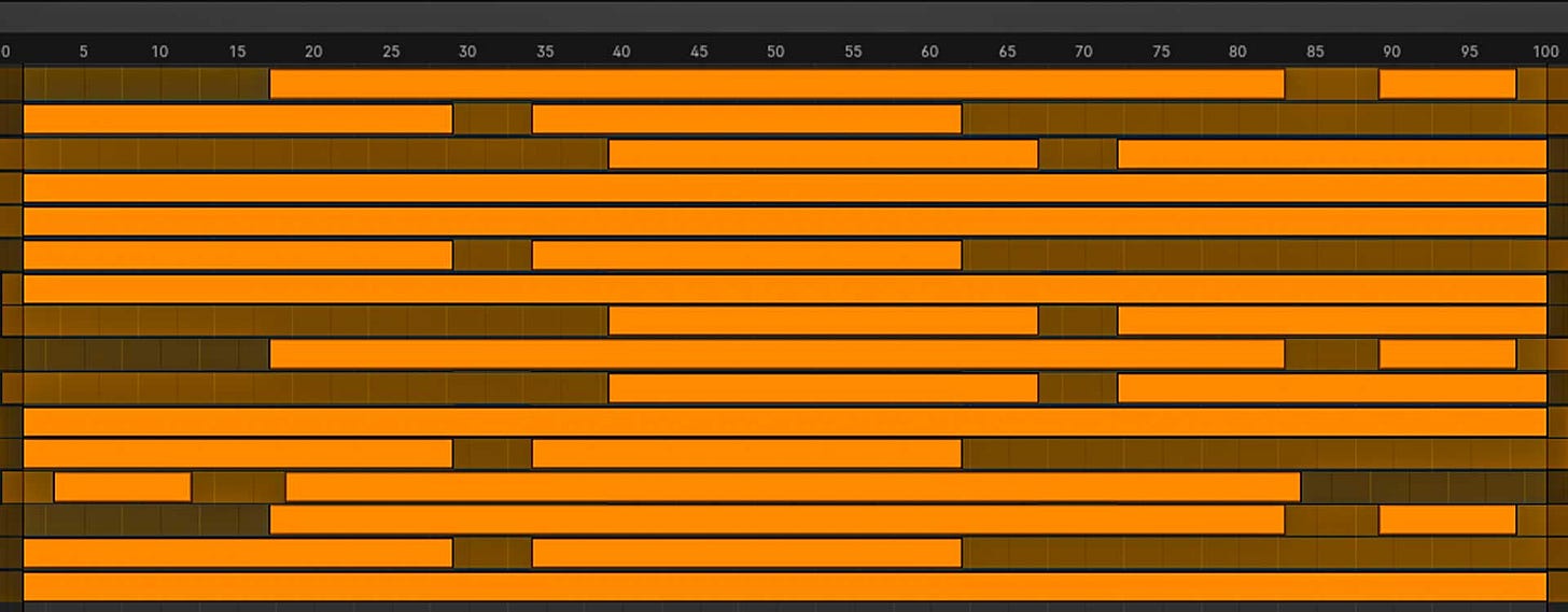
2. Once it’s finished, push the animation down into a NLA strip
3. Select the newly created strip and open the N-Panel of the NLA Editor (Hotkey: N)
4. Switch to the “Modifiers” tab and select the stepped interpolation modifier from the dropdown menu
Now the modifier is applied to every animated element that is part of that NLA strip.
*keep in mind that if you have multiple strips, you need to apply it to each individual strip
And the great part is, even if you want to adjust the animation afterwards, you can just open the NLA strip again and adjust it however you want.
So there’s never a point where you can’t go back.
Doing it this way has saved me a lot of time and stress, and I think it can do the same for you. :)
The Line Art Modifier - Things You Didn’t Know
The Grease Pencil “Line Art” modifier is pretty simple.
Until you go past the tutorials that are out there about it and explore all the extra settings you can adjust.
I’ve played around with them a bit in my recent projects and have found some interesting tricks and techniques that can create some really cool effects or just generally create a better looking end result:
The Occlusion Tab
Generally, what the Line Art modifier outlines is which edge or steep angle is the furthest in front, from the camera’s perspective.
But this setting allows you to define how many layers/levels it’s supposed to ignore.
This can be very useful if you, for example, only want to render the line art and not the actual 3D object.
Just place a plane in front of the camera and set the Level to 1. Now make sure that the plane has an emissive material and the Grease Pencil object is set to “In Front” under the Properties Panel > Object > Viewport Display.Edit Multiple Frames
This technique can save you a ton of time when you have to clean up the results of the line art modifier.
Once the animation is fully finished you can bake the line art that’s created by the modifier to do manual adjustments in Draw Mode.
But make sure that you enable this setting right here:This way you can make adjustments on multiple frames at once.
So if your character isn’t moving a lot and you want to get rid of the same line over multiple frames, select all keyframes you want to adjust, and now you can delete that line on each frame at the same time.Screen Space Stroke Thickness
Did you know that there are two settings that define how thick the Grease Pencil lines are?
The obvious one is the “Line Thickness” for the line art modifier, or the “Radius” for the grease pencil brush.
But the second one is hidden away under the Properties Panel > Data > Strokes
*make sure to have the grease pencil object selectedThe “Stroke Thickness” here is arguably more important than the actual thickness value but for some reason it’s hidden away as if you’re not supposed to find it.
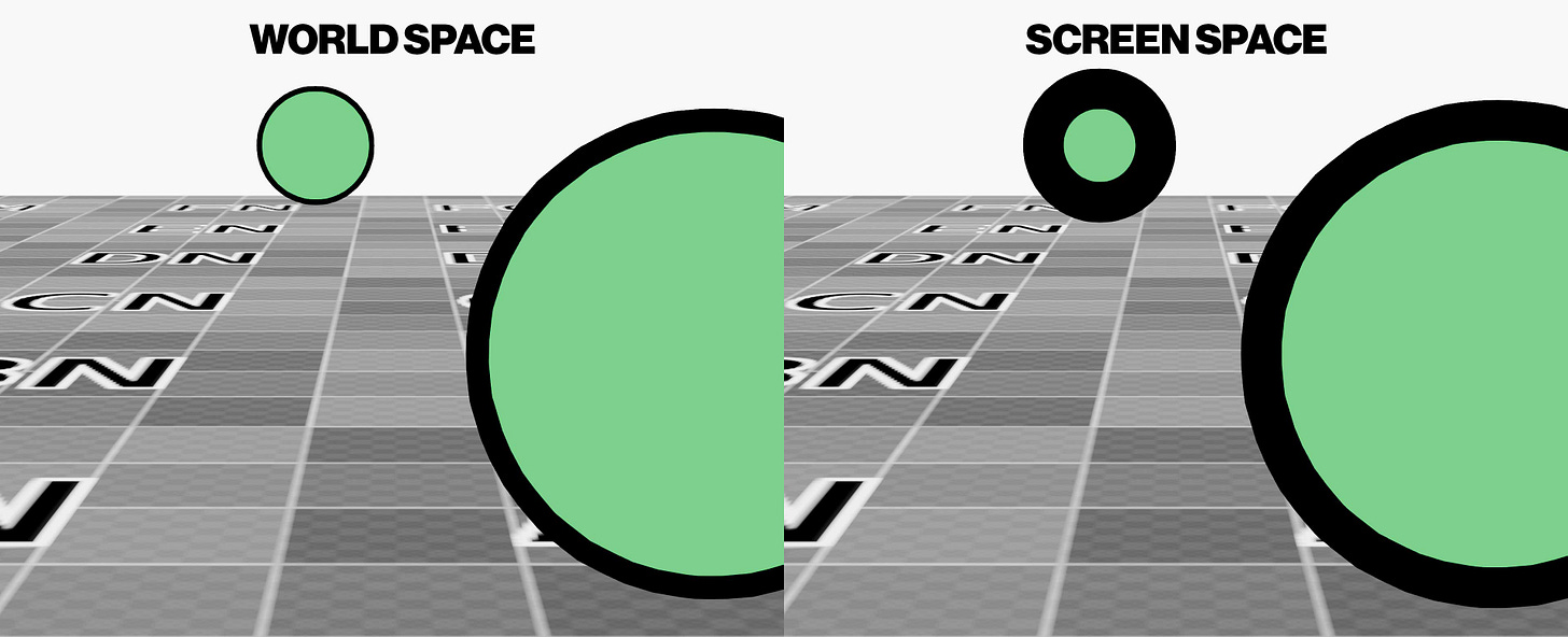
”World Space” means, the lines all have the same thickness, no matter where they are in the world.
”Screen Space” means, the lines all have the same thickness, from the perspective of the camera (and 3D viewport)Both settings have their use cases, but first you need to know that this setting exists before you can decide on one. :D
For a traditional anime animation for example I would set it to “Screen Space” so that all lines, no matter how close the characters are to the camera, have the same thickness.I hope I was able to show you a couple of new tips and tricks that you didn’t know before, that will improve the next project you’re working on. If you know someone that might find this post useful, feel free to share it with them.
And if you have any further questions you can either post them as comments under this post or join my Discord server, where I have a dedicated channel for any questions around Blender and 3D in general.


These tips are insane man. I've watched so many tutorials and I've never seen any of these tips before! Knowing how to edit the lineart modifier is such a lifesaver.
I’m taking this class called production rn and my project is to animate a fight scene with Naruto, and this is gonna help me so much thank you😭